Creating an Auto Resizing HTML Textarea using CSS and JavaScript Tutorial
In this tutorial, you can learn how to create an Auto Resizing HTML Textarea using CSS and JS. The tutorial aims to provide students and beginners with a reference for learning some useful CSS and JS tricks for their own website or web application projects. Here, I will be providing a web page script that demonstrates the creation of Auto Resizing textarea.
What is an Auto Resizing Textarea?
Auto Resizing Textarea is an HTML textarea element or multi-line text editing element that automatically resize its height each time the line height of the text is greater or lower than the element. It means that the textarea height is automatically resized according to the content line height while a normal textarea shows a scrollbar when the content exceeds the height of the element.
How to create an Auto Resizing Textarea?
The Auto Resizing Textarea can be easily achieved using CSS and JavaScript. Using the CSS script, we can set the default size or height of the textarea and its design. Then, JavaScript will detect the changes in the textarea content. Check out the sample web page script that I created provided below to have a better idea about creating an Auto Resizing Textarea.
Sample Web Page
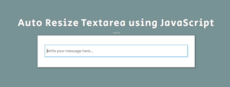
The below scripts result in a simple web application that contains an HTML Textarea that automatically resizes its height when the content exceeds or is lower than the current height of the textarea.
Page Interface
The script below is the HTML file script named index.html. It contains the elements of the page layout and the text area element.
- <!DOCTYPE html>
- <html lang="en">
- <head>
- <meta charset="UTF-8">
- <meta http-equiv="X-UA-Compatible" content="IE=edge">
- <meta name="viewport" content="width=device-width, initial-scale=1.0">
- <link rel="preconnect" href="https://fonts.googleapis.com">
- <link rel="preconnect" href="https://fonts.gstatic.com" crossorigin>
- <link rel="stylesheet" href="https://fonts.googleapis.com/css2?family=Material+Symbols+Outlined:opsz,wght,FILL,[email protected],100..700,0..1,-50..200" />
- <link rel="stylesheet" href="style.css">
- </head>
- <body>
- <div id="wrapper">
- <hr style="width:25px">
- <div id="content-wrapper">
- <div>
- </div>
- </div>
- </div>
- </body>
- </html>
Stylesheet
Here's the CSS file script that contains the style codes for the page layout and textarea design. The file script is known as style.css and it is loaded on the index page file script.
- @import url('https://fonts.googleapis.com/css2?family=Rubik&display=swap');
- @import url('https://fonts.googleapis.com/css2?family=Courgette&family=Secular+One&display=swap" rel="stylesheet');
- :root{
- --secular-font: 'Secular One', sans-serif;
- --satisfy-font: 'Satisfy', cursive;
- }
- *{
- box-sizing: border-box;
- }
- body *{
- font-family: 'Rubik', sans-serif;
- }
- /**
- Page Design
- */
- body,
- html{
- height: 100%;
- width: 100%;
- margin: 0;
- padding: 0;
- }
- body{
- background-color: #789395;
- }
- /* Page Wrapper */
- #wrapper{
- width: 100%;
- height: 100%;
- display: flex;
- flex-direction: column;
- align-items: center;
- justify-content: center;
- }
- .page-title{
- font-size: 35px;
- font-family: var(--secular-font);
- letter-spacing: 2px;
- text-align: center;
- color:#fff;
- text-shadow: 0px 0px 5px #7070709c;
- }
- /* Content Wrapper */
- #content-wrapper{
- width: 550px;
- background: #fff;
- border: 1px solid #cfcfcf;
- box-shadow: 1px 1px 5px #282828c4;
- padding:2em 1.5em;
- overflow: auto;
- }
- @media (max-width:550px){
- #content-wrapper{
- width: 100%;
- }
- }
- textarea#message {
- width: 100%;
- height: 42px;
- outline: none;
- border: 1px solid #b7b7b7;
- box-shadow: 1px 1px 5px #c1c1c1;
- resize: none;
- padding: 1em .5em;
- overflow: hidden;
- }
- textarea#message:focus {
- border-color: #52ace1;
- box-shadow: 1px 1px 3px #2aa7f19e;
- }
JavaScript
Lastly, the file script below is the JavaScript file named script.js. It contains the codes for updating or resizing the height of the textarea when the user updates its content and the current element's height is greater or less than the content line height or scroll height.
- const textAreaEL = document.getElementById('message')
- const AutoResizeTextarea = function(el){
- // Update Textarea Height to lowest temporarily
- el.style.height = '0px'
- // Update Textarea Height same as the the scrollHeight
- el.style.height= `${el.scrollHeight}px`
- }
- //When textare is updated
- textAreaEL.addEventListener('input', AutoResizeTextarea.bind(null, textAreaEL))
- //When textare has change
- textAreaEL.addEventListener('change', AutoResizeTextarea.bind(null, textAreaEL))
- //When textare is resized
- window.addEventListener('resize', AutoResizeTextarea.bind(null, textAreaEL))
Result
Here are the snapshots of the web page as a result of the scripts I provided above.
There you go! I have also provided the source code zip file on this website and it is free to download. Feel free to download and modify the sample script. The download button is located below this tutorial's content.
That's it! I hope this Creating an Auto Resizing HTML Textarea using CSS and JavaScript Tutorial will help you with what you are looking for and will be useful for your current and future web application projects.
Explore more on this website for more Tutorials and Free Source Codes.
Happy Coding =)
Add new comment
- 409 views


