Step-by-Step Guide to Creating a 3D Layer Effect with HTML and CSS
In this tutorial, we will build a simple web application featuring a 3D Layer Effect using HTML and CSS. This guide aims to provide you with creative ideas and practical techniques for designing interactive elements on a web application. These concepts can serve as inspiration and be valuable for enhancing the design of your future projects.
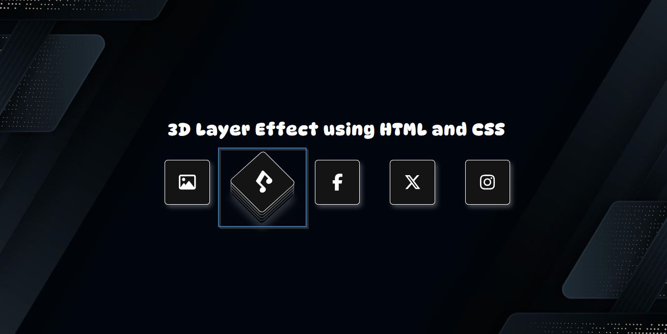
In the simple web application we’re about to create, we will design interactive card elements. The 3D Layer Effect will be activated when users hover over these cards, adding a visually appealing and dynamic touch to the user experience.
Let's proceed to the coding part.
Step 1: Creating the Interface
First, let’s create the HTML file for the application. This file will include the foundational HTML structure and elements essential to the app, such as the page background and the card components. Below is the HTML code snippet that you can use as a reference.
index.html
- <!DOCTYPE html>
- <html lang="en">
- <head>
- <meta charset="UTF-8">
- <meta name="viewport" content="width=device-width, initial-scale=1.0">
- <!-- Font Awesome -->
- <link rel="stylesheet" href="https://cdnjs.cloudflare.com/ajax/libs/font-awesome/6.7.2/css/all.min.css"
- integrity="sha512-Evv84Mr4kqVGRNSgIGL/F/aIDqQb7xQ2vcrdIwxfjThSH8CSR7PBEakCr51Ck+w+/U6swU2Im1vVX0SVk9ABhg=="
- crossorigin="anonymous" referrerpolicy="no-referrer" />
- <script src="https://cdnjs.cloudflare.com/ajax/libs/font-awesome/6.7.2/js/all.min.js"
- integrity="sha512-b+nQTCdtTBIRIbraqNEwsjB6UvL3UEMkXnhzd8awtCYh0Kcsjl9uEgwVFVbhoj3uu1DO1ZMacNvLoyJJiNfcvg=="
- crossorigin="anonymous" referrerpolicy="no-referrer"></script>
- <link rel="stylesheet" href="style.css">
- </head>
- <body>
- <div id="main-wrapper">
- <div id="LayerEffect">
- <div class="LayerEffect-item">
- <div>
- </div>
- </div>
- <div class="LayerEffect-item">
- <div>
- </div>
- </div>
- <div class="LayerEffect-item">
- <div>
- </div>
- </div>
- <div class="LayerEffect-item">
- <div>
- </div>
- </div>
- <div class="LayerEffect-item">
- <div>
- </div>
- </div>
- </div>
- </div>
- </body>
- </html>
Step 2: Createing th JS File
Next, let’s create a new Cascading Stylesheet (CSS) file. This file contains all the style scripts required for designing the application’s interface. It includes styles for the page structure, background, title elements, card components, and the 3D Layer Effect that activates on card hover. Check out the CSS code snippet below for detailed insights into the design process.
style.css
- * {
- font-family: "DynaPuff", serif;
- font-optical-sizing: auto;
- font-weight: 400;
- font-style: normal;
- font-variation-settings:
- "wdth" 100;
- }
- html, body{
- margin: unset;
- padding: unset;
- height: 100%;
- max-height: 100%;
- width: 100%;
- max-width: 100%;
- overflow: auto;
- }
- body {
- color: #fff;
- background-color: #141414;
- background-image: url(./dark-bg.jpg);
- background-repeat: no-repeat;
- background-size: cover;
- background-position: center center;
- display: inline-grid;
- justify-content: center;
- align-items: center;
- height: 100%;
- max-height: 100%;
- width: 100%;
- max-width: 100%;
- }
- #main-wrapper {
- width: 100%;
- max-width: 600px;
- padding: 20px 5px;
- }
- #app-title{
- font-size: 25px;
- font-weight: 700;
- letter-spacing: 1.5px;
- text-align: center;
- margin-bottom: 30px;
- }
- div#LayerEffect {
- display: flex;
- flex-flow: row wrap;
- gap: 1rem;
- justify-content: space-between;
- }
- div#LayerEffect .LayerEffect-item{
- margin-bottom: 15px;
- position: relative;
- transition: all .3s ease-in-out;
- width: 65px;
- height: 65px;
- }
- div#LayerEffect .LayerEffect-item > div {
- position: absolute;
- display: flex;
- align-items: center;
- justify-content: center;
- width: 65px;
- height: 65px;
- border: 1px solid #fff;
- border-radius: 5px;
- background-color: #141414;
- top:0;
- left:0;
- transition: all .3s ease-in-out;
- cursor: pointer;
- font-size: 25px;
- }
- div#LayerEffect .LayerEffect-item:hover {
- transform: rotate(-34deg) skew(11deg, -8deg);
- }
- div#LayerEffect .LayerEffect-item:hover > div:nth-child(1) {
- top: calc(3px * 4);
- left: calc(-3px * 4);
- opacity: .2;
- box-shadow: -5px 6px 10px #fcfcfcd6;
- }
- div#LayerEffect .LayerEffect-item:hover > div:nth-child(2) {
- top: calc(3px * 3);
- left: calc(-3px * 3);
- opacity: .3;
- }
- div#LayerEffect .LayerEffect-item:hover > div:nth-child(3) {
- top: calc(3px * 2);
- left: calc(-3px * 2);
- opacity: .4;
- }
- div#LayerEffect .LayerEffect-item:hover > div:nth-child(4) {
- top: calc(3px * 1);
- left: calc(-3px * 1);
- opacity: .5;
- }
- div#LayerEffect .LayerEffect-item > div:nth-child(5) {
- box-shadow: 3px 4px 7px #fcfcfc45;
- }
- div#LayerEffect .LayerEffect-item:hover > div:nth-child(5) {
- box-shadow: unset;
- }
Snapshots
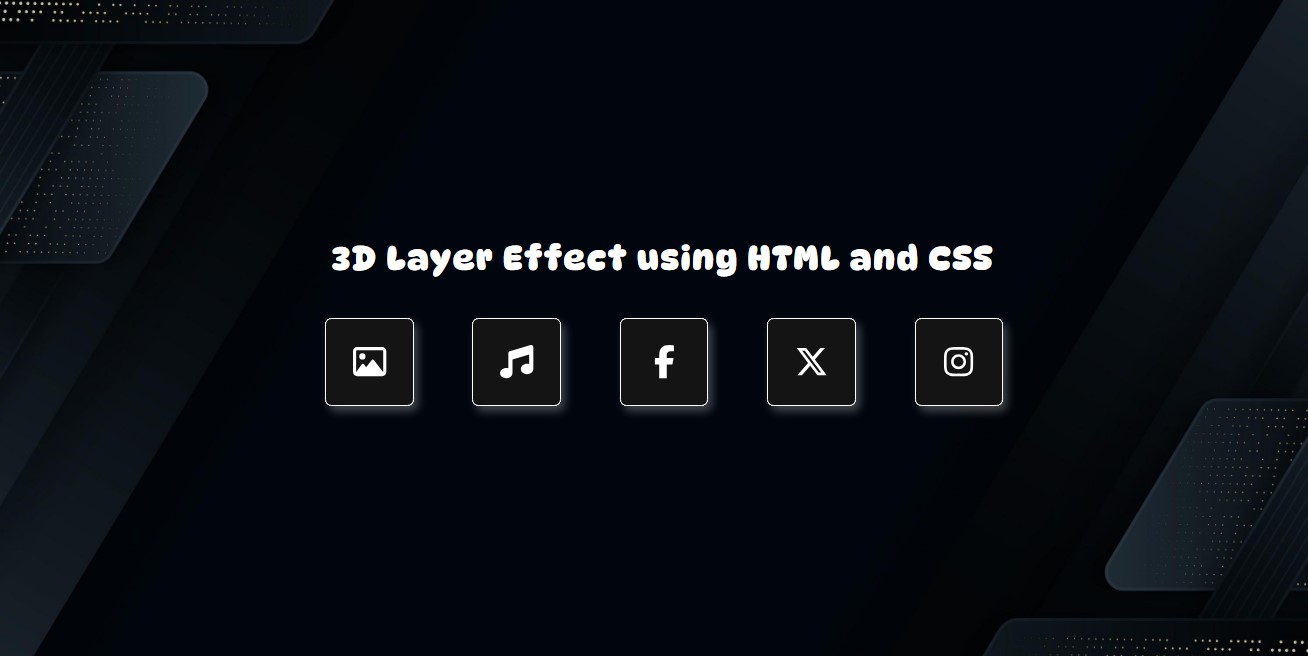
Here are the following screenshots of the result of the source code that I provided above.
When page is loaded

When card element is hovered

I have also provided a complete source code zip file for the scripts created in this tutorial. You can download it by clicking the download button located below this article. Feel free to download and customize it to suit your needs.
That’s it! I hope this tutorial on Creating a 3D Layer Effect using HTML and CSS helps you achieve your goals and provides valuable insights for your current or future projects.
Don’t forget to explore this website for more Tutorials, Free Source Codes, and Articles that cover various programming languages and techniques to enhance your development skills.
Happy Coding =)
Add new comment
- 255 views

