Creating a Popup Modal using HTML and CSS Only Tutorial
In this tutorial, you will learn how to create a Custom Popup Modal using only HTML and CSS. The main purpose of this tutorial is to give the students and new programmers a reference for learning how a popup modal or window is made using only CSS and HTML, Here, I will be providing a simple web application's scripts that demonstrate the main objective of this tutorial. A sample source code zip file is also provided and is free to download.
What is Popup Modal?
Modal is a user interface design of a window or panel of the page that overlays the whole page or part of the web page. It works like a dialog box or an alert but it is usually implemented to display other page content that is not visible yet on the page load. The modal window is created as a child window in front of the main window, which is still visible but is disabled.
How to Create a Custom Popup Modal?
We can simply achieve the Custom Popup Modal user interface and its functionality even only using HTML and CSS. With the help of some HTML elements and CSS properties/selectors/pseudo-element. Check out the following script to learn how to achieve it.
Example Web Application
Here are the scripts of simple web applications that demonstrate the creation of a Custom Popup Modal/Window using HTML and CSS only.
Creating the Interface
The following script is an HTML script that contains the HTML element that is relevant for creating a Popup window including the anchor links that will be used for opening the modal.
index.html
- <!DOCTYPE html>
- <html lang="en">
- <head>
- <meta charset="UTF-8">
- <meta http-equiv="X-UA-Compatible" content="IE=edge">
- <meta name="viewport" content="width=device-width, initial-scale=1.0">
- <link rel="preconnect" href="https://fonts.googleapis.com">
- <link rel="preconnect" href="https://fonts.gstatic.com" crossorigin>
- <link rel="stylesheet" href="style.css">
- </head>
- <body>
- <main>
- <section>
- <hr width="50px">
- <!-- Modal Link Container -->
- <div class="container">
- </div>
- <!-- End of Modal Link Container -->
- </section>
- </main>
- <!-- Modal Sample #1 -->
- <div id="modal1" class="modal">
- <div class="modal-container">
- <div class="modal-header">
- </div>
- <div class="modal-body">
- <p>Lorem ipsum dolor sit amet, consectetur adipiscing elit. Proin tincidunt ex sit amet pretium molestie. Integer et ipsum at lacus luctus aliquet ac id tortor. Maecenas metus eros, mollis eu libero nec, dictum dapibus risus. Proin varius magna velit, nec maximus quam auctor nec. Vivamus ligula nibh, lacinia a interdum et, vestibulum tincidunt est. Sed ornare, justo at cursus faucibus, purus turpis venenatis augue, quis bibendum nisi leo et libero. Aenean blandit nisl sem, in euismod sem dapibus quis. Etiam efficitur a nisl quis mollis. Suspendisse accumsan id justo non porttitor. Ut auctor tincidunt sem. Etiam in libero vitae urna pretium ornare eu eu leo. Nullam eu nulla at sem bibendum lobortis sit amet ac risus. Donec porta maximus urna, in suscipit tortor hendrerit in.</p>
- </div>
- </div>
- </div>
- <!-- End of Modal Sample #1 -->
- <!-- Modal Sample #2 -->
- <div id="modal2" class="modal">
- <div class="modal-container">
- <div class="modal-header">
- </div>
- <div class="modal-body">
- <p>Sed pharetra tempor turpis et luctus. Nullam cursus diam mi, quis interdum justo finibus vel. Sed hendrerit venenatis nisl vitae imperdiet. Nulla arcu orci, tincidunt vitae augue quis, tempus pellentesque justo. Quisque faucibus varius nunc, eget luctus enim iaculis gravida. Morbi ut dictum enim. Nullam mattis elit nec metus cursus malesuada. Morbi justo felis, rutrum non vestibulum tincidunt, tincidunt quis odio. In vel congue nisi. Sed finibus eros at mi accumsan, non vulputate tellus vehicula. Curabitur ac vehicula est. In fringilla orci ac erat aliquam posuere. Nulla ipsum risus, pharetra a sapien eu, dignissim maximus nisi. Mauris lacinia libero a ex maximus, scelerisque semper nisl porttitor. Pellentesque ultricies rhoncus commodo. Pellentesque vitae metus vitae lectus venenatis pellentesque.</p>
- </div>
- </div>
- </div>
- <!-- End of Modal Sample #2 -->
- </body>
- </html>
Creating the Stylesheet
Next, we'll create the web page, containers, anchors, and modals stylesheet for the design and display action of modals when triggered open. Here's the following CSS script.
style.css
- @import url('https://fonts.googleapis.com/css2?family=Rubik&display=swap');
- body *{
- font-family: 'Rubik', sans-serif;
- }
- /**
- Page Design
- */
- body,
- html,
- main{
- height: 100%;
- width: 100%;
- margin: 0;
- padding: 0;
- }
- body{
- background-color: #6096B4;
- }
- main{
- display: flex;
- width: 100%;
- flex-direction: column;
- align-items: center;
- justify-content: center;
- }
- /**
- Modal Anchors Container and Buttons
- */
- .container{
- width: 300px;
- height: 400px;
- background-color: #fff;
- box-shadow: 1px 1px 7px #000;
- border-radius:5px;
- margin: auto;
- display: flex;
- flex-direction: column;
- align-items: center;
- justify-content: center;
- }
- .modal-btn{
- padding: 1em .5em;
- border: 1px solid #d2d2d2;
- border-radius: 3px;
- width: 200px;
- text-align: center;
- margin-bottom: 5px;
- text-decoration: none;
- color:#000;
- font-weight: bolder;
- background: #f5f5f5;
- }
- /**
- Modal Design
- */
- .modal-btn:hover,
- .modal-btn:active{
- background: #ececec;
- color:#141414;
- }
- .modal{
- position: fixed;
- top: 0;
- left: 0;
- width: 100%;
- height: 100%;
- overflow: hidden;
- display: flex;
- flex-direction: column;
- align-items: center;
- justify-content: center;
- z-index: 99;
- backdrop-filter: brightness(0.5);
- visibility: hidden;
- opacity: 1;
- transition: opacity .3s ease-in-out;
- }
- .modal:before{
- content: "";
- position: absolute;
- width: 100%;
- height: 100%;
- cursor:pointer;
- z-index: 101;
- }
- /** Displaying Modal */
- .modal:target{
- visibility: visible;
- opacity: 1;
- }
- .modal .modal-container{
- width: 500px;
- z-index: 101;
- }
- .modal .modal-header {
- min-height: 50px;
- overflow: auto;
- width: 100%;
- background: #fff;
- padding: 0.5em 1em;
- border-bottom: 1px solid #bbbbbb;
- display: flex;
- align-items: center;
- justify-content: space-between;
- }
- .modal .modal-body {
- min-height: 100px;
- max-height: calc(100vh - 100px);
- overflow: auto;
- width: 100%;
- background: #fff;
- padding: 0.5em 1em;
- }
- /**
- Modal Close Button
- */
- .btn-close {
- text-decoration: none;
- font-weight: bolder;
- padding: 0.5em;
- color: #484848;
- }
- .btn-close:hover,
- .btn-close:active {
- color: #484848;
- }
Snapshots
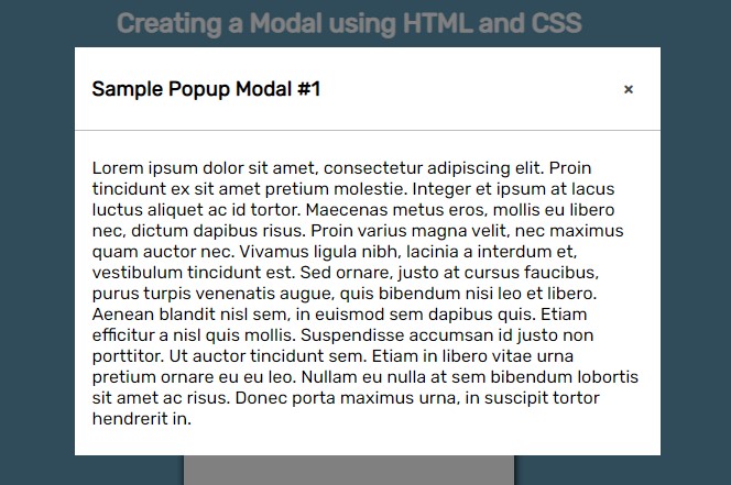
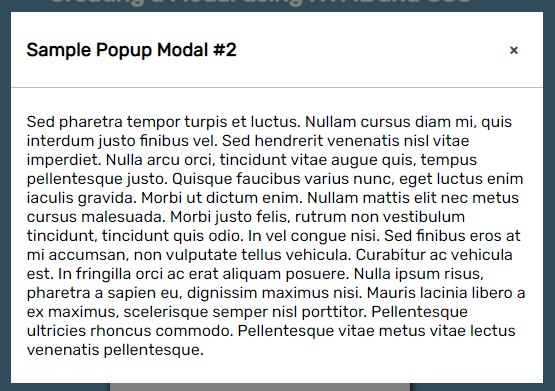
Here are the snapshots of the simple web page that demonstrate the Custom Popup Modal using the script that I provided above.
Web Page
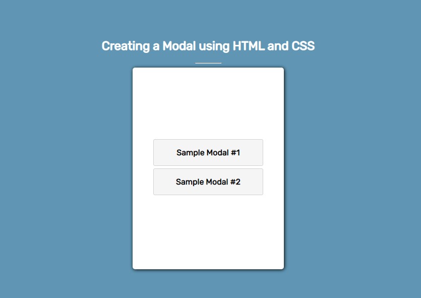
Sample Modal #1
Sample Modal #2
There you go! I also provided the source code zip file of the scripts that I provided above. You can download it by clicking the download button located below this tutorial's content.
That's the end of this tutorial! I hope this Creating a Popup Modal using HTML and CSS Only Tutorial will help you with what you are looking for and will be useful for your current and future web application projects.
Explore more on this website for more Tutorials and Free Source Codes.
Happy Coding =)
Add new comment
- 986 views