Creating a Parallax Website Design using Pure CSS Tutorial
In this tutorial, you will learn to Create a Parallax Website Design using Pure CSS. The tutorial aims to provide students, self-learners, and new programmers with a reference for learning some new things that can be used to build a creative and interactive website design using Cascading Stylesheets Scripts. Here, I will be providing a simple web page source code or script that demonstrates the creation of a simple Parallax Effect/Design.
What is Parallax?
A website's surfing experience can be enhanced by implementing a Parallax Scrolling Effect and making it more engaging and dynamic. In its most basic form, parallax scrolling is a three-dimensional (3D) effect that gives a website additional depth. This kind of effect is commonly used in a single-page website.
Why use Parallax Scrolling Effect on the website?
Parallax Scrolling Effect is not a must-have feature for websites or web application landing pages. This feature is just giving the end-user a better experience while exploring the information on the site page. If you wish to develop a creative and interactive website or landing pages with a faux-3D effect, Parallax may be useful.
How to Create a Parallax Scrolling Effect using Pure CSS?
Using some CSS property and pseudo-element, we can simply achieve the Parallax Scrolling Effect. Here are some of the properties and elements that are useful for creating Parallax Scrolling:
- ::before pseudo-element
- ::after pseudo-element
- background-attachment:fixed
- position:absoulute
Example
To have a better understanding of how to use the given CSS pseudo-elements and properties to create a Parallax Scrolling Effect on an actual website page.
Interface
Assuming that the following HTML script is the sample landing page of a site. The script contains a simple navigation bar, a footer, and 3 different content sections. The script below loads the Bootstrap 5 Framework and Google Fonts CDN for some of the design of the page which means an internet connection is required in order to browse the page properly. Save the file as index.php.
- <!DOCTYPE html>
- <html lang="en">
- <head>
- <meta charset="UTF-8">
- <meta http-equiv="X-UA-Compatible" content="IE=edge">
- <meta name="viewport" content="width=device-width, initial-scale=1.0">
- <link rel="preconnect" href="https://fonts.googleapis.com">
- <link rel="preconnect" href="https://fonts.gstatic.com" crossorigin>
- <link href="https://fonts.googleapis.com/css2?family=Amatic+SC:wght@700&display=swap" rel="stylesheet">
- <link rel="stylesheet" href="https://cdn.jsdelivr.net/npm/[email protected]/dist/css/bootstrap.min.css">
- <link rel="stylesheet" href="assets/css/styles.css">
- <script src="https://cdn.jsdelivr.net/npm/[email protected]/dist/js/bootstrap.bundle.min.js"></script>
- </head>
- <body>
- <nav class="navbar navbar-expand-lg navbar-dark bg-gradient bg-dark fixed-top">
- <div class="container">
- </div>
- </nav>
- <div id="main-wrapper">
- <section id="section-1" class="parallax-section">
- </section>
- <section id="section-2" class="parallax-section">
- <div class="container h-100">
- <div class="h-100 w-100 d-flex justify-content-center align-items-center">
- <h3 class="text-light mx-auto" style="font-family:cursive">Lorem ipsum dolor sit amet, consectetur adipiscing elit. Maecenas nisi mauris, molestie in dolor quis, varius sodales sapien. Aenean lacinia vel justo at scelerisque. Vestibulum turpis magna, scelerisque id erat eu, elementum egestas sapien. Quisque ultricies orci libero, nec consequat mi egestas vitae.</h3>
- </div>
- </div>
- </section>
- <section id="section-3" class="parallax-section">
- </section>
- </div>
- <footer class="shadow-top py-4 col-auto bg-dark text-light">
- <div class="">
- <div class="text-center">
- </div>
- <div class="text-center">
- </div>
- </div>
- </footer>
- </body>
- </html>
In the HTML script above, we will use the #section-1, #section-2, and #section-3 content elements for Parallax Scrolling Effect.
Cascading Stylesheet (CSS) Script
The following script is the CSS code that creates the Parallax Scrolling Effect of the mentioned page sections. Save this file as styles.css and make sure to load this CSS file in your index.html.
- /** Font Famaily **/
- body #main-wrapper *{
- font-family: 'Amatic SC', cursive;
- }
- html, body{
- height: 100%;
- width: 100%;
- overflow-x: hidden;
- }
- /** sections */
- .parallax-section{
- width: 100%;
- height: 80vh;
- position:relative;
- }
- /** section2: Paragraph Panel */
- #section-2{
- background-color:#2e2e2e;
- }
- /** section 1 & 3: Default Design */
- #section-1, #section-3{
- display: flex;
- align-items: center ;
- justify-content: center;
- font-size: 7rem;
- color: #fff;
- text-shadow:0px 0px 5px #000
- }
- /** section 1: Background*/
- #section-1:before {
- position: absolute;
- content: "";
- width: 100%;
- height: 100vh;
- background-attachment: fixed;
- background-image: url(./../img/bg-1.png);
- background-size: cover;
- background-repeat: no-repeat;
- z-index: -1;
- }
- /** section 3: Background*/
- #section-3:before {
- position: absolute;
- content: "";
- width: 100%;
- height: 100vh;
- background-attachment: fixed;
- background-image: url(./../img/bg-2.png);
- background-size: cover;
- background-repeat: no-repeat;
- z-index: -1;
- }
The script provided above will output a simple website or web application page with a simple parallax scrolling effect. The first and third content section has background images that keep their position while scrolling.
Snapshots
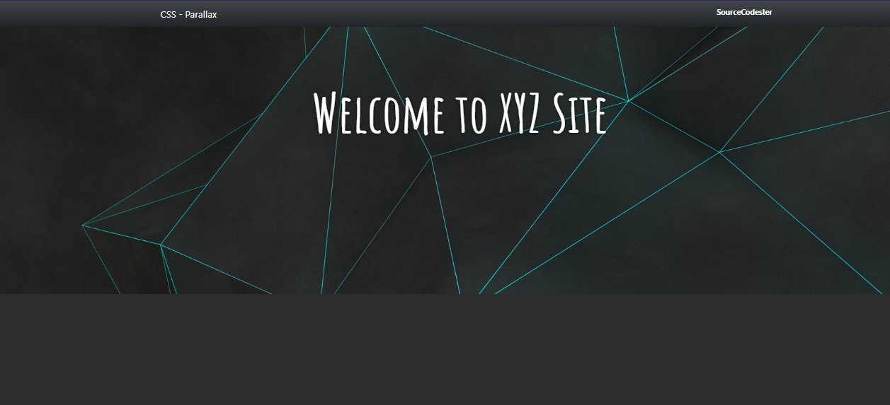
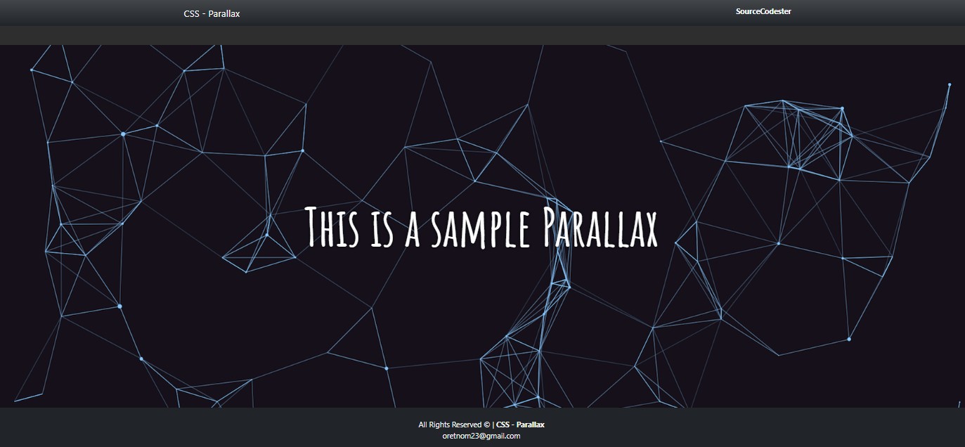
Here are the snapshots of the content section 1 and 3 of the web page.
Section 1
Section 3
DEMO VIDEO
I have also provided the source code zip file of the sample web application that demonstrates the Parallax Effect on this website and it is free to download. You can download it by clicking the Download button located below this tutorial's content.
There you go! I hope this Creating a Parallax Website Design using Pure CSS Tutorial will help you with what you are looking for and will be useful for your current and future web application projects.
Explore more on this website for more Tutorials and Free Source Codes.


