Creating a 3D Cube Effect using CSS Tutorial

In this article, you can learn to create a simple 3D Cube Effect transition using CSS. This tutorial's main purpose is to provide students and beginners with a reference for learning some CSS techniques and tricks to build or develop creative user interfaces or designs. Here, I will be providing simple web page scripts that demonstrate the creation of a simple HTML element with a 3D Cube Effect.

What is the 3D Cube Effect?

The 3D Cube Effect is a 3-dimensional effect that simulates the transition or animation like an actual cube. This simple effect can be used for any HTML block element.

How to create a 3D Cube Effect?

We can simply achieve the 3D Cube Effect animation or transition for HTML elements using only Pure CSS. CSS comes with multiple useful properties which allow us to create 3D effects such the transform, transform-style, and perspective. These 3 CSS properties allow us to achieve the cube effect. Check out the following sample web page script that I created to understand more about how can you create a 3D cube effect animation.

About the Sample Web Page

The scripts that I will be providing will result in a simple web page that contains a single box. The 3D cube effect will be triggered when the user hovers over the box. When the box has hovered, another box will be shown from the top of the current box and the current box will be hidden using the 3D cube effect as the transition of changes.

HTML

Here's the HTML file script of the web page named index.html. It contains the HTML elements used for creating the Cube Effect.

  1. <!DOCTYPE html>
  2. <html lang="en">
  3.     <meta charset="UTF-8">
  4.     <meta http-equiv="X-UA-Compatible" content="IE=edge">
  5.     <meta name="viewport" content="width=device-width, initial-scale=1.0">
  6.     <title>CSS - 3d Cube Effect</title>
  7.     <link rel="preconnect" href="https://fonts.googleapis.com">
  8.     <link rel="preconnect" href="https://fonts.gstatic.com" crossorigin>
  9.     <link rel="stylesheet" href="https://fonts.googleapis.com/css2?family=Material+Symbols+Outlined:opsz,wght,FILL,[email protected],100..700,0..1,-50..200" />
  10.     <link rel="stylesheet" href="style.css">
  11. </head>
  12.     <div id="wrapper">
  13.         <div class="page-title">CSS - 3d Cube Effect</div>
  14.         <hr style="margin:auto; width:25px">
  15.         <div id="cube-wrapper">
  16.             <div class="cube">
  17.                 <div class="top-box">
  18.                     Top View
  19.                 </div>
  20.                 <div class="front-box">
  21.                     Hover Me
  22.                 </div>
  23.             </div>
  24.         </div>
  25.     </div>
  26. </body>
  27. </html>

Stylesheet

Here's the CSS file script named style.css that contains the styles or the code for designing the page layout and the box element.

  1. @import url('https://fonts.googleapis.com/css2?family=Courgette&family=Secular+One&display=swap" rel="stylesheet');
  2. :root{
  3.     --secular-font: 'Secular One', sans-serif;
  4. }
  5. *{
  6.     box-sizing: border-box;
  7. }
  8. body *{
  9.     font-family: 'Rubik', sans-serif;
  10. }
  11. /**
  12. Page Design
  13. */
  14. body,
  15. html{
  16.     height: 100%;
  17.     width: 100%;
  18.     margin: 0;
  19.     padding: 0;
  20. }
  21. body{
  22.     background-color: #363636;
  23. }
  24. /* Page Wrapper */
  25. #wrapper{
  26.     width: 100%;
  27.     padding: 3em 5em;
  28. }
  29. .page-title{
  30.     font-size: 2.5rem;
  31.     font-weight: 500;
  32.     color: #fff;
  33.     letter-spacing: 3px;
  34.     font-family: var(--secular-font);
  35.     text-align: center;
  36. }
  37. /* Cube Wrapper and Container */
  38. #cube-wrapper{
  39.     width: 200px;
  40.     height: 200px;
  41.     margin: auto;
  42.     margin-top: 2em;
  43. }
  44. .cube{
  45.     width: 100%;
  46.     height: 100%;
  47.     position: relative;
  48.     transform-style: preserve-3d;
  49.     perspective: 450px;
  50.     perspective-origin: top;
  51.     transition: transform .5s ease;
  52. }
  53.  
  54. .front-box,
  55. .top-box{
  56.     position: absolute;
  57.     width: 100%;
  58.     height: 100%;
  59.     top: 0;
  60.     left: 0;
  61.     box-shadow: 0px 0px 7px #fff;
  62.     transition: transform .5s ease;
  63.     display: flex;
  64.     align-items: center;
  65.     justify-content: center;
  66.     font-size: 40px;
  67.     font-weight: 800;
  68.     color: #fff;
  69.     text-shadow: 0px 0px 5px #000000;
  70.     letter-spacing: 5px;
  71.     text-align: center;
  72. }
  73. .top-box{
  74.     background-color: #B6E2A1;
  75.     transform: translate(0, -100%) rotateX(90deg);
  76.     transform-origin: bottom;
  77. }
  78. .front-box{
  79.     /* display: none; */
  80.     background-color: #AEE2FF;
  81.     transform-origin: top;
  82.  
  83. }
  84. .cube:hover .top-box{
  85.     transform: translate(0, 0) rotateX(0deg);
  86.  
  87. }
  88. .cube:hover .front-box{
  89.     transform: translate(0, 100%) rotateX(-90deg);
  90. }  

The script above contains all the properties needed to create a 3D cube effect when hovering the element on the web page.

Snapshots

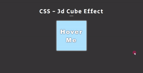
On page load, the box on the web page will display like the following image.

3D Cube Effect Animation using CSS

The following image is the snapshot of the box while it is transitioning to display the top view of the cube.

3D Cube Effect Animation using CSS

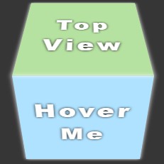
After the successful transition, the box will be displayed like the following image.

3D Cube Effect Animation using CSS

DEMO

Here's the overall result of the scripts that I provided above.

3D Cube Effect Animation using CSS

There you go! I have also provided the complete source code zip file of the scripts and it is free to download on this site. To download it, you can simply click the download button located below this tutorial's content.

That's it! I hope this Creating a 3D Cube Effect using CSS Tutorial will help you with what you are looking for and will be useful for your current and future web application projects.

Happy Coding =)

Comments

Hello oretnom32! are you from Philippines? i just need it for research purposes thankyou!

Add new comment