Different Kinds of User Input in HTML/HTML5 using Bootstrap Templates
Submitted by alpha_luna on Monday, September 26, 2016 - 15:18.

User Input in HTML/HTML5 using Bootstrap Templates
Using HTML/HTML5 you can enabled to create new input elements for the HTML Forms. In this tutorial, we are going to learn HTML forms used to select different kinds of user input and pass this information to a server. They are Color, Date, DateTime, Time, Month, Week, Email, Number, Range, Search, Tel and URL. . A form can also contain select lists, textarea, fieldset, legend, and label elements. Try the Live Demo. Kindly click the button below. TheThe Input Element
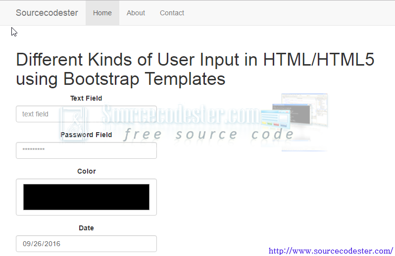
An input element is used to select user information and can vary in many ways, depending on the type attribute. An input element can be text field, checkbox, password, radio button, submit button, and more.Text Field
A text field is a one-line input field that a user can enter text into. It is defined by- <input type="text" />
Password Field
A password field is the same as text field except the entered characters are masked (shown as asterisks or circles). It is defined as- <input type="password" />
Radio Buttons
Radio buttons are used to allow the user to select only one from a number of choices. It is defined as- <input type="radio" />
Checkboxes
Checkboxes are used to allow a user to select zero or more options from a number of choices. It is defined as- <input type="checkbox" />
Submit Button
A submit button is used to send form data to a server. The submit button causes the page specified by the action attribute of the<form> element to be executed. It is defined as
- <input type="submit" />
HTML5 New Form Attributes
HTML5 added new attributes for the<form> and <input> elements.
The new attributes for <form> are:
- autocomplete - specifies that the form should have an autocomplete function
- novalidate - specifies that the form should not be validated when submitted
HTML5 New Input Types
HTML5 added several new input types for forms to provide better input control and validation. The new input types are:Color
- color - specifies that the input field should contain a color
- <input type="color" placeholder="e.g. #c0c0c0" />
Date
- date - specifies that the input field should contain a date (date, month, year)
- <input type="date" min="2010-11-01" max="2011-11-01" value="2010-11-01"/>
- datetime - specifies that the input field should contain time and date (time, date, month, year in UTC time)
- datetime-local - specifies that the input field should contain time and date (time, date, month, year in local time)
- month - specifies that the input field should contain a month and year
- week - specifies that the input field should contain a week and year
- time - specifies that the input field should contain a time (hour and minute)
- email - specifies that the input field should contain an e-mail address
- <input type="email" placeholder="[email protected]" />
Search
- search - specifies the input field should appear as a search field
- <input type="search" results="10" placeholder="Search..." />
- URL: - specifies the input field should contain a URL
Number
- number - specifies the input field should contain a numeric value
- <input type="number" step="1" min="-5" max="10" value="0" />
Range
- range - specifies the input field should contain a value from a range of numbers (slider bar)
- <input type="range" min="0" max="50" value="10" />
Telephone
- tel - specifies the input field should contain a telephone number
- <input type="tel" placeholder="(101) 555-1212" pattern="^\(?\d{3}\)?[-\s]\d{3} [-\s]\d{4}.*?$" />
Output