How to Build a Draggable Tabs Slider with HTML, CSS, and JavaScript?
In this tutorial, we will explore how to create a Draggable Tabs Slider using HTML, CSS, and JavaScript. This feature has become increasingly popular in modern web applications due to its versatility and user-friendly functionality.
The main goal of this tutorial is to provide you with ideas and techniques for building a useful and effective feature that can enhance the user experience in your future web development projects. A Draggable Tabs Slider, as discussed in this tutorial, is a horizontally scrollable container that displays a list of items. Users can easily navigate through the content by dragging left or right, offering an intuitive and interactive browsing experience.
This feature is particularly useful for applications such as product carousels, horizontal menus, or showcasing multiple items in a compact space. By the end of this tutorial, you’ll have a solid understanding of how to implement and customize this functionality for your projects.
Let’s dive into creating a draggable tabs slider and take your web application design to the next level!
Step 1: Creating the User Interface
To get started, let’s create the foundational HTML file for our application with the draggable tabs slider. This file will contain all the key elements necessary to structure the slider and define the content that will be displayed within it.
Begin by creating a new HTML file and save it as index.html. Naming the file index.html. Check the following HTML code that I created.
- <!DOCTYPE html>
- <html lang="en">
- <head>
- <meta charset="UTF-8">
- <meta name="viewport" content="width=device-width, initial-scale=1.0">
- <link rel="stylesheet" href="style.css">
- <link rel="stylesheet" href="https://fonts.googleapis.com/css2?family=Material+Symbols+Outlined:opsz,wght,FILL,GRAD@24,400,0,0" />
- </head>
- <body>
- <div id="main-wrapper">
- <div id="slider-tab">
- <button id="slider-tab-left-btn" class="slider-tab-nav-btn" aria-label="Slide Left">
- </button>
- <ul id="slider-list">
- </ul>
- <button id="slider-tab-right-btn" class="slider-tab-nav-btn" aria-label="Slide Right">
- </button>
- </div>
- </div>
- </body>
- </html>
This HTML file will act as the backbone of our project, where we define the slider container, tab items, and any additional elements required for the functionality. In the next steps, we’ll enhance it further by styling the layout with CSS and adding interactivity with JavaScript.
Step 2: Styling the Interface
Next, let’s create the Cascading Stylesheet (CSS) file to define the design and styling of our application's interface. This file will help bring the visual elements of the draggable tabs slider to life by adding colors, fonts, and layout styles.
Create a new CSS file and save it as style.css. This file also contain the CSS code responsible for styling the tabs, ensuring they are displayed horizontally and have a polished and user-friendly appearance.
The style.css file is essential for customizing the interface, enhancing user engagement, and making the application visually appealing. With well-organized CSS, you can achieve a consistent and professional design for your web application. Below, you’ll find sample CSS rules to start designing the tabs and other components.
- @import url('https://fonts.googleapis.com/css2?family=Ubuntu+Mono:ital,wght@0,400;0,700;1,400;1,700&display=swap');
- *{
- font-family: "Ubuntu Mono", serif;
- font-weight: 400;
- font-style: normal;
- }
- strong, b {
- font-weight: 700;
- }
- html, body{
- height: 100%;
- max-height: 100%;
- width: 100%;
- max-width: 100%;
- overflow: auto;
- padding: unset;
- margin: unset;
- box-sizing: border-box;
- }
- body{
- display: flex;
- flex-flow:column;
- justify-content: center;
- align-items: center;
- background-image: linear-gradient(120deg, #f093fb 0%, #f5576c 100%);
- }
- #main-wrapper{
- width: 100%;
- max-width: 700px;
- }
- #page-title{
- text-align: center;
- color: #fff;
- text-shadow: 0px 3px 5px #2c2c2c;
- margin-bottom: 30px;
- }
- /* Slider Tab Container */
- #slider-tab{
- width: 100%;
- max-width: 400px;
- margin: auto;
- background-color: #fff;
- box-shadow: 0px 3px 5px #3e3e3e;
- border-radius: 50px;
- padding: 0 15px;
- position: relative;
- display: flex;
- justify-content: space-between;
- overflow: hidden;
- }
- /* Scroll or Slide Buttons */
- button.slider-tab-nav-btn {
- position: absolute;
- top: 0;
- height: 100%;
- width: 50px;
- border: unset;
- cursor: pointer;
- user-select: none;
- }
- /* Left Scroll or Slide Button */
- button#slider-tab-left-btn {
- left: 0;
- background: linear-gradient(90deg, #ffffff 50%, transparent);
- text-align: start;
- transition: all .2s ease-in-out;
- padding-left: 10px;
- }
- button#slider-tab-left-btn:hover {
- background: linear-gradient(90deg, #e5e5e5 50%, transparent);
- }
- /* Right Scroll or Slide Button */
- button#slider-tab-right-btn {
- right: 0;
- background: linear-gradient(270deg, #ffffff 50%, transparent);
- text-align: end;
- padding-right: 10px;
- }
- button#slider-tab-right-btn:hover {
- background: linear-gradient(270deg, #e5e5e5 50%, transparent);
- }
- /* Slider Tab List Container */
- ul#slider-list{
- display: flex;
- flex-grow: 1;
- flex-wrap: nowrap;
- overflow: hidden;
- padding: 10px 28px;
- margin: unset;
- cursor: e-resize;
- scroll-behavior: smooth;
- }
- /* Slider Tab List Items */
- ul#slider-list > li.slider-item{
- list-style: none;
- margin: 3px 10px;
- padding: 5px 15px;
- border-radius: 10px;
- color: #4a4a4a;
- background-color: #efefef;
- border-color: #f3f3f37a;
- box-shadow: 2px 3px 3px #cacaca7a;
- cursor: pointer;
- user-select: none;
- }
- /* Slider Tab List Items when hovered*/
- ul#slider-list > li.slider-item:hover{
- color: #f4f3f3 !important;
- background-color: #639cff !important;
- border-color: #639cff !important;
- box-shadow: 1px 2px 3px #00000045 !important;
- }
- /* Slider Tab List Items is active*/
- li.slider-item.active {
- color: #f4f3f3 !important;
- background-color: #1a6af5 !important;
- border-color: #1a6af5 !important;
- box-shadow: 1px 2px 3px #0000009e !important;
- }
Step 3: Creating the Main Functions
Lastly, let’s create the JavaScript file that will enable the functionality of our Draggable Tabs Slider. This file will contain the event handlers and logic required to make the tabs slider interactive and fully functional.
Create a new JavaScript file and name it script.js. This file will handle the essential events such as left and right scroll button interactions, click events for changing the active tab, and drag-to-scroll functionality for navigating through the tabs.
The script.js file is the backbone of the application’s interactivity, ensuring smooth and responsive user experience. Below, you’ll find the JavaScript code that demonstrates how to implement these key features and achieve the main functions of the draggable tabs slider.
- // Slider Container
- const sliderTab = document.querySelector("#slider-tab")
- // Slider List
- const sliderList = sliderTab.querySelector("#slider-list")
- // Slider Buttons
- const slideLeftBtn = sliderTab.querySelector("#slider-tab-left-btn")
- const slideRightBtn = sliderTab.querySelector("#slider-tab-right-btn")
- // Change Active Tab Item when Clicked
- sliderList.querySelectorAll(".slider-item").forEach(function(el){
- el.addEventListener("click", function(e){
- e.preventDefault();
- sliderList.querySelector(".slider-item.active").classList.remove("active");
- el.classList.add("active")
- })
- })
- // Left Slide Button Event Listener
- slideLeftBtn.addEventListener("click", function(e){
- e.preventDefault();
- // Current Scroll
- var currentSliderOffset = sliderList.scrollLeft;
- // Decrease offset 100px to scroll left
- var newSlideOffset = currentSliderOffset - 100;
- // If new scroll offset is less than to scrollwidth, use set 0 as the new offset
- if(newSlideOffset < 0)
- newSlideOffset = 0;
- // Update Scroll Offset
- sliderList.scrollLeft = newSlideOffset;
- })
- // Right Slide Button Event Listener
- slideRightBtn.addEventListener("click", function(e){
- e.preventDefault();
- // Scroll Width
- var sliderWidth = sliderList.scrollWidth;
- // Current Scroll
- var currentSliderOffset = sliderList.scrollLeft;
- // Add 100px to scroll right
- var newSlideOffset = currentSliderOffset + 100;
- // If new scroll offset is greater than to scrollwidth, use scroll width
- if(newSlideOffset > sliderWidth)
- newSlideOffset = sliderWidth;
- // Update Scroll Offset
- sliderList.scrollLeft = newSlideOffset;
- })
- /**
- * Dragging / Sliding Tabs Events
- */
- var dragSlider = false;
- var dragStartX = 0;
- var dragEndX = 0;
- // mouse down event
- sliderList.addEventListener("mousedown", function(e){
- e.preventDefault;
- // Identifier to start drag event
- dragSlider = true;
- // Starting Point of dragging
- dragStartX = e.clientX;
- })
- // mouse move event
- window.addEventListener("mousemove", function(e){
- e.preventDefault;
- // Check if drag has started
- if(!dragSlider)
- return;
- // X axis point where current drag located
- dragEndX = e.clientX;
- // Compute the difference between the starting and ending X axis Point
- var dragDiff = dragEndX - dragStartX;
- // Update scroll offset
- sliderList.scrollLeft = sliderList.scrollLeft - dragDiff;
- })
- // mouse up event
- window.addEventListener("mouseup", function(e){
- // Check if drag has started
- if(!dragSlider)
- return;
- // Reset Dragging Events Variables
- dragSlider = false;
- dragStartX = 0;
- dragEndX = 0;
- })

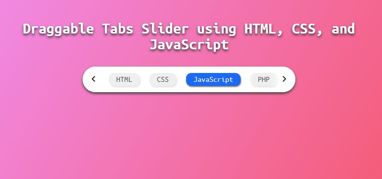
The image above is a screenshot showcasing the result of the script provided in this tutorial. It shows how the application comes together using the HTML, CSS, and JavaScript code we've implemented.
I have also provided the complete source code available for download in a zip file. You can access the source code by clicking the download button located below this article. Feel free to download, modify, and customize the code according to your needs for your own web development projects.
This resource is designed to help you better understand the implementation process, and you can adapt the code to create similar features or experiment with different functionality for your future applications.
There you have it! You can now test the application with the Draggable Tabs Slider on your end and see if it works as we expected. I hope this tutorial will help you and give you some ideas and techniques for developing your own web application features.
Explore more on this website for more Tutorial, Free Source Codes, and Articles covering various programming languages.
Happy Coding
Comments
Add new comment
- Add new comment
- 371 views

