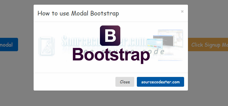
How to use Modal Bootstrap
Submitted by alpha_luna on Friday, September 2, 2016 - 11:32.
Good day everyone, today, we are going to tackle about Bootstrap Modals. It is the front-end designing purpose whatever you want to use it. You can use it to any confirmation, to add, edit, delete data, to view data in the modal form, and to maximize the space of your page when you using it. It’s easy to learn on how to construct the source code for the modal bootstrap and it is one of the most useful jQuery Bootstrap plugins nowadays. It contains jQuery, CSS, components and its plugins. Let’s start to create modal bootstrap.
You can also check the live demo of this simple tutorial, so you can get an idea and you can try this out, let's start coding.
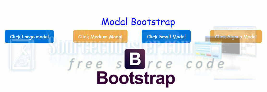
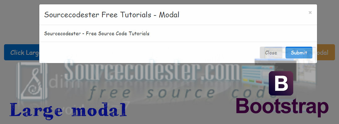
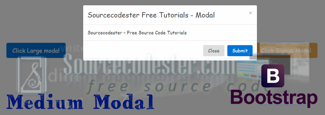
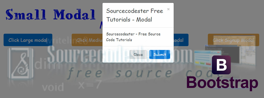
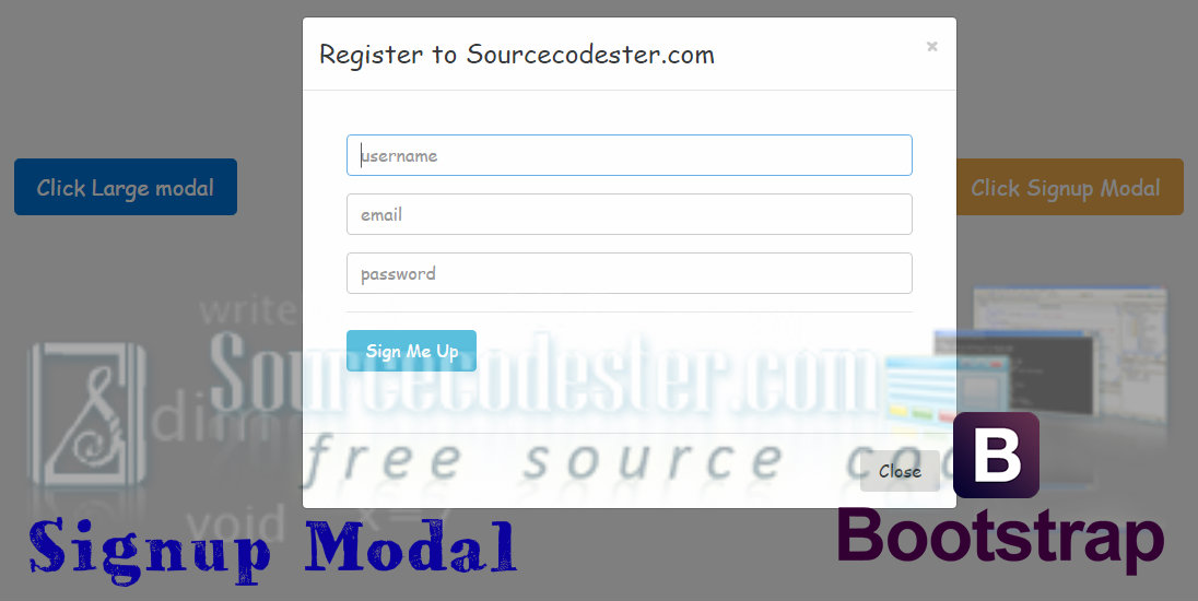
As you can see in the image above, you can easily create a custom pop-up modal, as I told earlier, it is multi-purpose so it can be used as your alerts, or any confirmation in your systems, programs, or in your websites. That's it, kindly click the "Download Code" button below for the full source code. And try it to customize your own modals. Enjoy coding. If you are interested in programming, we have an example of programs that may help you even just in small ways. Share us your thoughts and comments below. Thank you so much for dropping by and reading this tutorial post. For more updates, don’t hesitate and feel free to visit this website more often and please share this with your friends or email me at [email protected]. Practice Coding. Thank you very much.
Required
We are going to need this three link to run the modal bootstrap, kindly add the CSS link to your HEAD tag and the js link before the end of your BODY tag.
The Modal
We all know bootstrap modal is a lightweight multi-purpose and responsively on any device or PC to used and it can be easy to customize it. This is the HTML Markup in a modal window.- <!-- Modal -->
- <div class="modal fade" id="largeModal" tabindex="-1" role="dialog" aria-labelledby="myModalLabel">
- <div class="modal-dialog modal-lg" role="document">
- <div class="modal-content">
- <div class="modal-header">
- </div>
- <div class="modal-body">
- Sourcecodester - Free Source Code Tutorials
- </div>
- <div class="modal-footer">
- </div>
- </div>
- </div>
- </div>
The Modal Trigger
Using this button link, we can trigger the modal window source code above.Examples of Modal Bootstrap
Large Modal

Medium Modal

Small Modal

SignUp Modal

As you can see in the image above, you can easily create a custom pop-up modal, as I told earlier, it is multi-purpose so it can be used as your alerts, or any confirmation in your systems, programs, or in your websites. That's it, kindly click the "Download Code" button below for the full source code. And try it to customize your own modals. Enjoy coding. If you are interested in programming, we have an example of programs that may help you even just in small ways. Share us your thoughts and comments below. Thank you so much for dropping by and reading this tutorial post. For more updates, don’t hesitate and feel free to visit this website more often and please share this with your friends or email me at [email protected]. Practice Coding. Thank you very much.

