How To Use Modal Bootstrap
Submitted by alpha_luna on Saturday, May 14, 2016 - 14:13.

Modal Bootstrap
In this tutorial, we are going talk about on Modal Bootstrap. We all know that bootstrap is the front-end designing purpose and this is suit for the mobile for the responsive function. Everyone can learn bootstrap in easy ways even you are a beginner. Today, we talk about the Modal Bootstrap. It is one of the familiar to use in Bootstrap plugin. It contains CSS, jQuery, plugins and other components. We can use to have a sign-up form, confirmation to delete data, and to edit data, etc. Let’s start with:Modal Bootstrap Example - Source Code with Image
Source code for our Modal Window
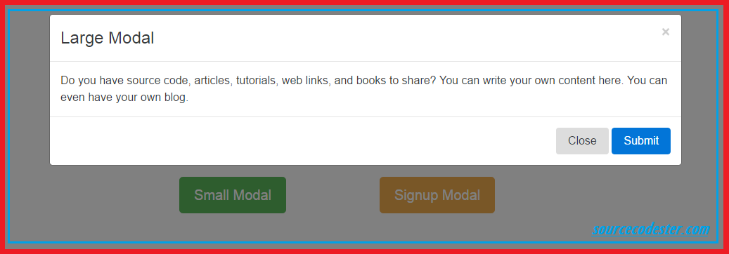
For Large Modal- <!-- Large Modal -->
- <div class="modal fade" id="largeModal" tabindex="-1" role="dialog" aria-labelledby="myModalLabel">
- <div class="modal-dialog modal-lg" role="document">
- <div class="modal-content">
- <div class="modal-header">
- </div>
- <div class="modal-body">
- Do you have source code, articles, tutorials, web links,
- and books to share? You can write your own content here. You can even have your own blog.
- </div>
- <div class="modal-footer">
- </div>
- </div>
- </div>
- </div>
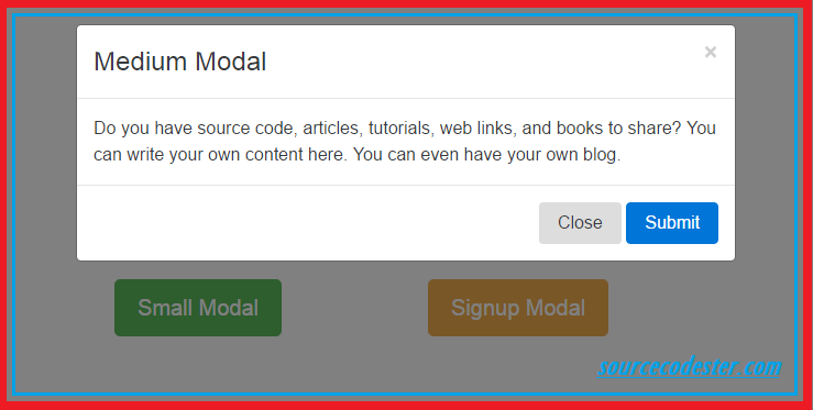
 For Medium Modal
- <!-- Medium Modal -->
- <div class="modal fade" id="mediumModal" tabindex="-1" role="dialog" aria-labelledby="myMediulModalLabel">
- <div class="modal-dialog modal-md">
- <div class="modal-content">
- <div class="modal-header">
- </div>
- <div class="modal-body">
- Do you have source code, articles, tutorials, web links,
- and books to share? You can write your own content here. You can even have your own blog.
- </div>
- <div class="modal-footer">
- </div>
- </div>
- </div>
- </div>
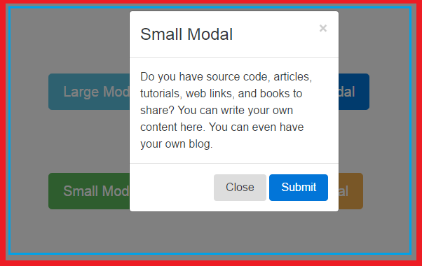
 For Small Modal
- <!-- Small Modal -->
- <div class="modal fade" id="smallModal" tabindex="-1" role="dialog" aria-labelledby="mySmallModalLabel">
- <div class="modal-dialog modal-sm">
- <div class="modal-content">
- <div class="modal-header">
- </div>
- <div class="modal-body">
- Do you have source code, articles, tutorials, web links,
- and books to share? You can write your own content here. You can even have your own blog.
- </div>
- <div class="modal-footer">
- </div>
- </div>
- </div>
- </div>
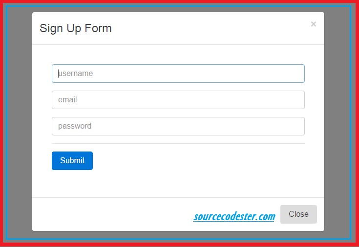
 For Sign-Up Modal
- <!-- Sign-Up Modal -->
- <div class="modal fade" id="signupModal" tabindex="-1" role="dialog" aria-labelledby="mySigninLabel">
- <div class="modal-dialog modal-md">
- <div class="modal-content">
- <div class="modal-header">
- </div>
- <div class="modal-body" style="padding:40px 40px;">
- <form role="form">
- <div class="form-group">
- <input type="text" placeholder="username" class="form-control" />
- </div>
- <div class="form-group">
- <input type="text" placeholder="email" class="form-control" />
- </div>
- <div class="form-group">
- <input type="password" placeholder="password" class="form-control" />
- </div>
- <div class="form-group">
- <hr>
- </div>
- <div class="form-group">
- </div>
- </form>
- </div>
- <div class="modal-footer">
- </div>
- </div>
- </div>
- </div>
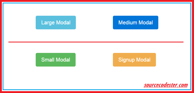
Trigger Of Large, Medium, Small, and Sign-Up Modal
- <table width="100%" style="margin-top:100px;">
- <tr>
- <td style="padding: 20px;">
- <div class="form-group">
- <div class="col-sm-3">
- </div>
- </div>
- </td>
- <td>
- <div class="form-group">
- <div class="col-sm-3">
- </div>
- </div>
- </td>
- </tr>
- <tr>
- </tr>
- <tr>
- <td style="padding: 20px;">
- <div class="form-group">
- <div class="col-sm-3">
- </div>
- </div>
- </td>
- <td>
- <div class="form-group">
- <div class="col-sm-3">
- </div>
- </div>
- </td>
- </tr>
- </table>