Creating a Layered Image Effect using HTML and CSS Tutorial
This tutorial will help you to learn how to Create a Layered Image Effect using HTML and CSS. The purpose of this tutorial is to provide the students and beginners with a reference to enhance their knowledge and skills in terms of developing a website with a creative user interface. Here, snippets and scripts of a sample web page that demonstrate the said 3D effect of an image are provided. I have also provided the complete source code files that I created for this tutorial.
What is Layered Image Effect?
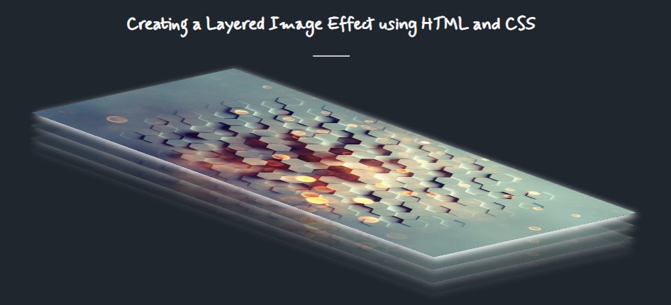
A Layered Image Effect is a type of three-dimensional (3D) effect in a website of the web application. It is composed of multiple image layers of the same image which has different CSS designs such as opacity/transparency and position.
How to create a Layered Image Effect?
The Layered Image Effect is not that complicated or hard to create using HTML and CSS. Using the available pseudo-elements and properties of CSS, we can easily achieve this kind of 3D effect.
Here's the list of HTML elements, CSS pseudo-elements, and properties that are useful to achieve the Layered Image Effect:
- HTML DIV Element <div></div>
- HTML Image Element <img/>
- CSS Hover pseudo-element ::hover
- CSS nth-child selector :nth-child(n)
- CSS Transform property [value: matrix/matrix3D]
- CSS Opacity property
- CSS Rotate property
- CSS Transition property
- and some other common CSS properties
Steps of Creating a Layered Image Effect
Here are the steps that you must follow for creating the Layered Image Effect.
- Create the Image container and add the multiple image tag with the same image in it.
- Customize the design of the images and hide the other layers by default
- Add the Layered Images Effect styles using the :hover selector.
Example
Here are the scripts that demonstrate the layered image effect in a simple web page
Interface
The below script is the HTML code that contains the image container and layers.
- <!DOCTYPE html>
- <html lang="en">
- <head>
- <meta charset="UTF-8">
- <meta http-equiv="X-UA-Compatible" content="IE=edge">
- <meta name="viewport" content="width=device-width, initial-scale=1.0">
- <link rel="preconnect" href="https://fonts.googleapis.com">
- <link rel="preconnect" href="https://fonts.gstatic.com" crossorigin>
- <link href="https://fonts.googleapis.com/css2?family=Mynerve&display=swap" rel="stylesheet">
- <link rel="stylesheet" href="style.css">
- </head>
- <body>
- <section>
- <hr width="50px">
- <!-- Layered Image Container -->
- <div class="layered-img-container">
- <img src="geo-portrait.jpg" alt="Sample Portait Image"/>
- <img src="geo-portrait.jpg" alt="Sample Portait Image"/>
- <img src="geo-portrait.jpg" alt="Sample Portait Image"/>
- <img src="geo-portrait.jpg" alt="Sample Portait Image"/>
- </div>
- <!-- End of Layered Image Container -->
- </section>
- </body>
- </html>
Here's the default custom stylesheet of the web page.
- :root{
- --mynerve-font:'Mynerve', cursive;
- --light-color:#f9f9f9;
- --dark-color:#20262E;
- }
- body,
- html{
- height: 100%;
- width: 100%;
- }
- h1{
- font-family: var(--mynerve-font)
- }
- .text-center{
- text-align: center;
- }
- html{
- overflow: hidden;
- }
- body{
- background-color: var(--dark-color);
- color:var(--light-color);
- overflow:auto;
- margin: 0;
- padding: 0;
- }
- section{
- padding-top: 20vh;
- width: calc(100%);
- display: flex;
- flex-direction: column;
- align-items: center;
- justify-content: center;
- }
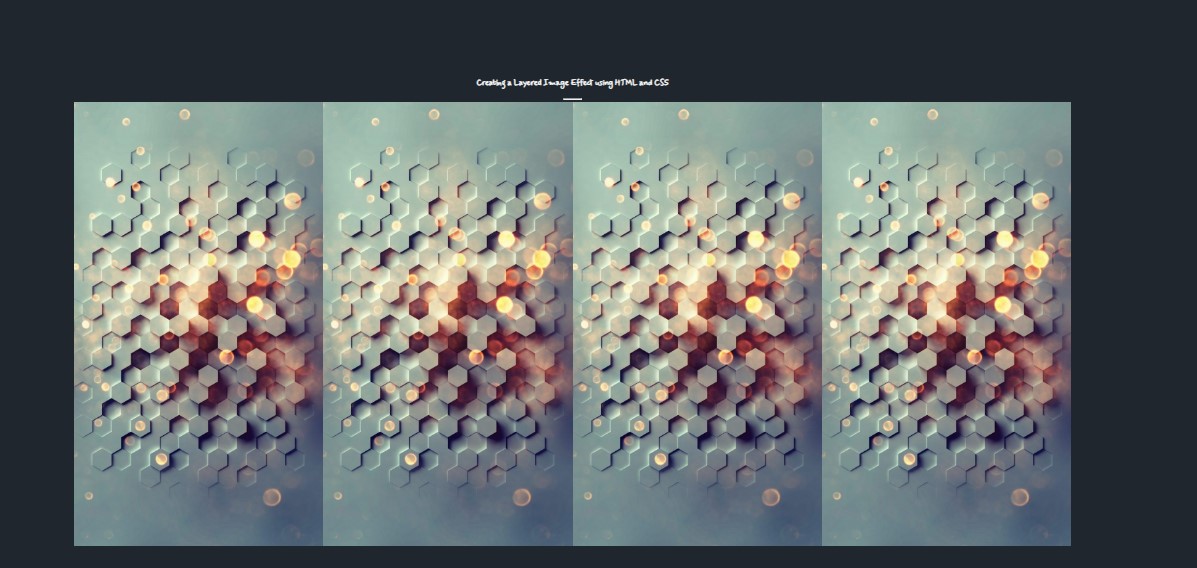
Using only the script above will result in something like the following image:

Customize the Images Layers
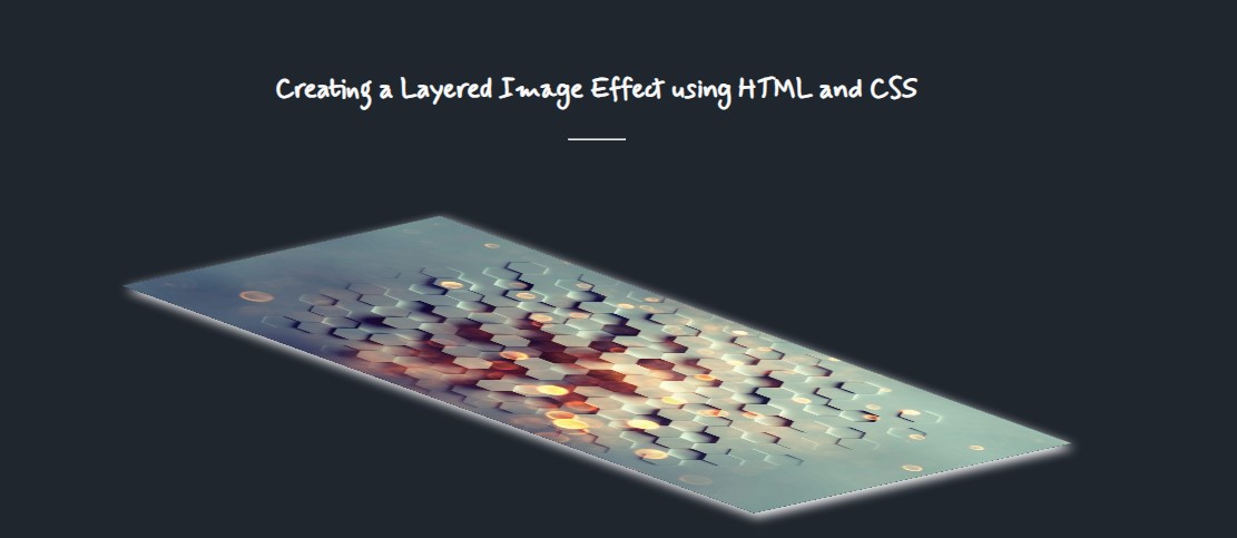
Next, let's customize the design or the style of the image on how it looks by default. Also, we'll hide the other layers.
- /**
- * Image Container and Default Design
- */
- .layered-img-container {
- display: flex;
- position: relative;
- margin: auto;
- width: 100%;
- align-items: center;
- justify-content: center;
- cursor: pointer;
- }
- .layered-img-container img {
- position: absolute;
- height: 60vh;
- width: 30vh;
- top: 0;
- transform: matrix(1.5, .2, 1.2, 1, 0, 0);
- rotate: 160deg;
- transition: all .5s ease-in-out;
- }
- .layered-img-container img:nth-child(4){
- box-shadow: 3px -5px 6px #fff;
- }
- .layered-img-container img:nth-child(1),
- .layered-img-container img:nth-child(2),
- .layered-img-container img:nth-child(3){
- opacity: 0;
- }

Add the Layered Image Effect
Then, let's add the styles for the design transition of the 3D effect we wanted to achieve which is the layered image effect.
- /**
- * Image Hovered Effect (Layered Image)
- */
- .layered-img-container:hover img{
- box-shadow: 3px -5px 6px #fff;
- }
- .layered-img-container:hover img:nth-child(4){
- transform: matrix(1.5, .2, 1.2, 1, -21, 47);
- }
- .layered-img-container:hover img:nth-child(3){
- transform: matrix(1.5, .2, 1.2, 1, -13, 31);
- opacity: .4;
- }
- .layered-img-container:hover img:nth-child(2){
- transform: matrix(1.5, .2, 1.2, 1, -6, 14);
- opacity: .3;
- }
- .layered-img-container:hover img:nth-child(1){
- transform: matrix(1.5, .2, 1.2, 1, 0, 0);
- opacity: .09;
- }
- .layered-img-container:active img {
- rotate: 0deg;
- transform: unset;
- box-shadow: 1px 2px 10px #fff;
- height: auto;
- width: 18vw;
- }

There you go! You can now browse the script on your end to your preferred browser and check if it works and achieve the requirement that we wanted to achieve. The 3D effect will be only triggered when you hover over the image container.
I have also provided the complete source code zip file that I created for this tutorial on this site. It is free to download. The download button is located below this tutorial's content. Feel free to download and modify it the way you desire to meet your own requirements.
That's it! I hope this Creating a Layered Image Effect using HTML and CSS Tutorial will help you with what you are looking for and will be useful for your current and future website development.
Explore more on this website for more Tutorials and Free Source Codes.

